


by Cascade Team, on Aug 23, 2019 12:33:09 AM
Dashboards are about to come to life with our game-changing new generation of Widgets. We're excited to introduce you to the new Table Widget, our most customizable Dashboard feature ever! From Balanced Scorecards to Status Tracking, the new Widget will transform your Dashboard displays into powerful reporting tools.
Before we dive into how to set up some examples, lets talk about what makes the new Widget our favorite yet.
Firstly, it looks really really good! We're not superficial or anything... but this is important because we want you to be inspired every time you look at your Goals, and the Table Widget makes them extra nice to look at with its clean and minimal design. Plus, the colors match your branding to keep your Cascade looking consistent and beautiful.
It also looks the way you want it to look. Because it is so customizable, you can show your data in the way that looks best to you. Add and remove columns as you please, then drag them in to any order and resize them until they look just right. You can also remove specific Goals, even if they fit all your filters but don’t really belong in your table. Maybe you want to group your Goals by their status to see what is overdue on the top of your table. Or maybe you prefer to have a column that lists the status, which you can then sort depending on what you want to see at the time! With the new Table Widget, all of this and more is possible.
And the more Table Widgets you use, the more powerful your Dashboards will become. You can make multiple Tables that relate to the same project, but highlight different areas of value. This allows you to visualize and compare your Goals clearly depending on what it is you want to see first. For example, you could create a Table for each of your Sales team members to see how their KPIs are tracking, or look at how KPIs are tracking across the whole organization by creating a table for each that sit next to each other on the same Dashboard.
We could go on all day about the reasons why you should add a Table Widget to all of your Dashboards right now. But we mainly love it because it's going to make you a pro at reporting on your Goals! Take it from our very own Customer Success Manager, Spencer, who is so excited to show his clients how they can use the new Widget to add powerful value to their Dashboards:
“One of my clients has 10 or so Departments with multiple KPIs in each Department's plan. Now they can pull all the KPIs from each individual plan into a single Widget. If they wanted to, they also have to ability to pull all KPIs in their whole instance and sort by Plan. The flexibility of creating these different reporting visuals with the new Table Widget is great!” - Spencer, Cascade Customer Success Manager in Portland, OR
So, where do I start?
Now let's explain how we created our pictured examples below. Or you can get started on your own by simply adding a Table Widget based on the default 'My Goals' to set up a Table that shows all of your Goals, then you can play around with the filters and columns to discover what's possible!
Example 1. Project Status by Attributes
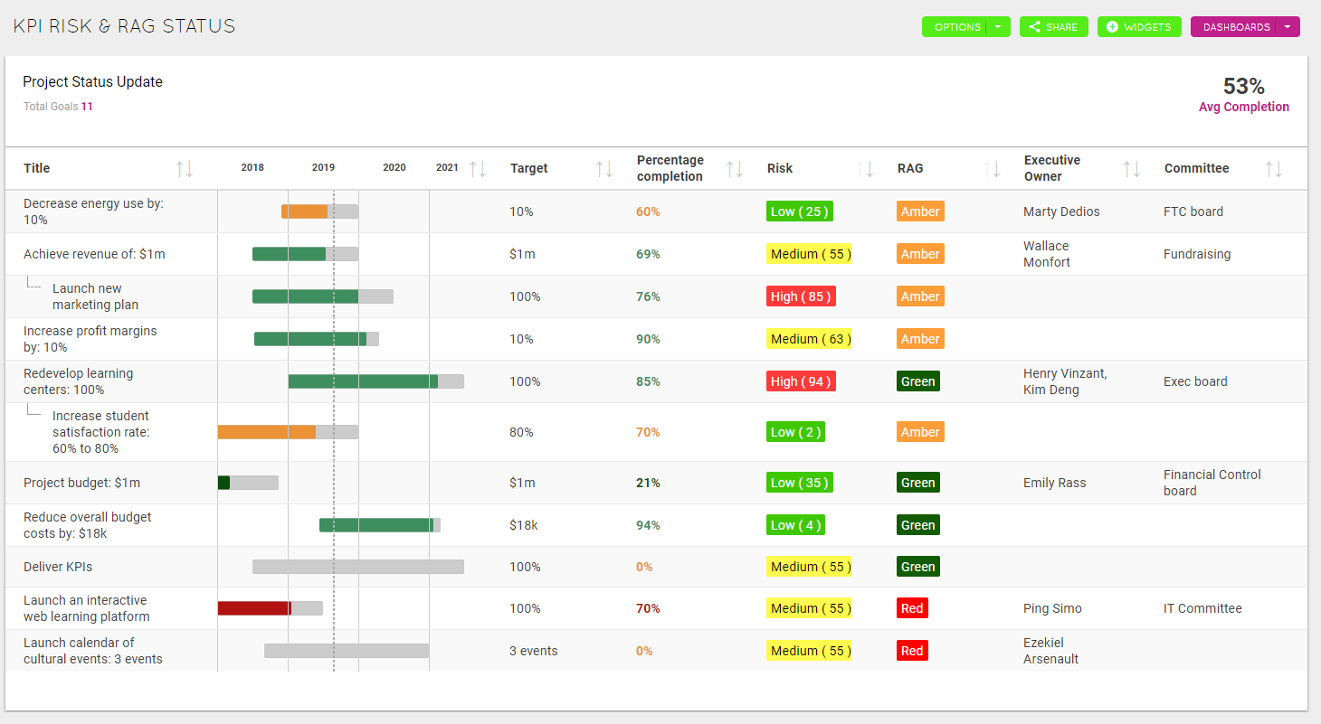
The Table Widget works great with Templates & Custom Fields, especially if you configure your Custom Fields to have different colored background and text. This Table Widget best exemplifies the power of this by showing the Risk and RAG columns, which have previously been set up to be customized colors. In this example, I have simply filtered by 'Template' > 'KPI' and added the several columns shown. But the power comes from the fact that KPI Templates have been customized to show the RAG and Risk Fields as different colors dependent on their grouping. To achieve this, edit a relevant Template and look for this icon![]() when editing the grouping within a Field.
when editing the grouping within a Field.
Example 2. Sales Team Dashboard
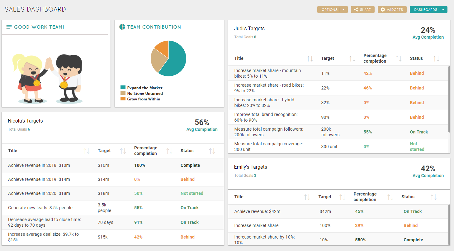
This is a good example of how you can use the Table Widget to compare the progress of individual team members. To set up this example:
- Add your Table Widget
- Click on 'My Goals' and clear the filter
- 'Add Condition' select 'User' > 'is' > *Name of Team Member* (for example 'Judi Mizzel')
- Save by clicking the green tick
 in the top-right corner
 - Use the column icon
 found when you hover under the avg completion to remove Timeline, and then add Target and Status columns (or whichever column is relevant)
 - Drag the columns to be in the best order, and resize them until you are happy with how it looks
- Clone this Widget to quickly create Tables for each User and edit the settings to replace the filter with their name. Repeat for each Team Member that you want to include
Note: To clone simply click on the three dots in the top-right corner of the Widget and select 'Clone'. Then click these dots again to edit the settings and replace the item name with another Scorecard - Rearrange and resize the Widgets until the Dashboard looks perfect
Note: This Dashboard also has a Contribution and Note Widget to display other aspects of the Team's Strategy.
Example 3. Balanced Scorecard
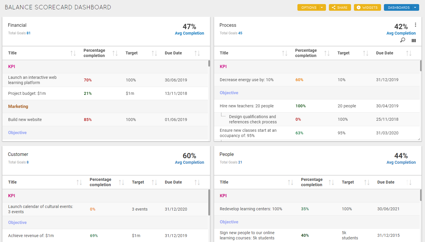
This Dashboard is great for visualizing the performance of each Balanced Scorecard for your whole Organization. To set up this example:
- Add your Table Widget
- Click on 'My Goals' and clear the filter
- 'Add Condition' select 'Scorecard' > 'is' > *Name of Scorecard* (for example 'Financial')
- Under Settings select Group by 'Goal Template'
- Save by clicking the green tickin the top-right corner
- Use the column iconfound when you hover under the avg completion to remove Timeline, and then add Target and Due Date columns
- Drag the columns to be in the best order, and resize them until you are happy with how it looks
- Clone this Widget to quickly create the other three Scorecard Tables by replacing the filter with your next Scorecard name. Repeat for all Scorecards
Note: To clone simply click on the three dots in the top-right corner of the Widget and select 'Clone'. Then click these dots again to edit the settings and replace the item name with another Scorecard. - Rearrange and resize the Widgets until the Dashboard looks perfect
Example 4. Status of Your Team's Objectives
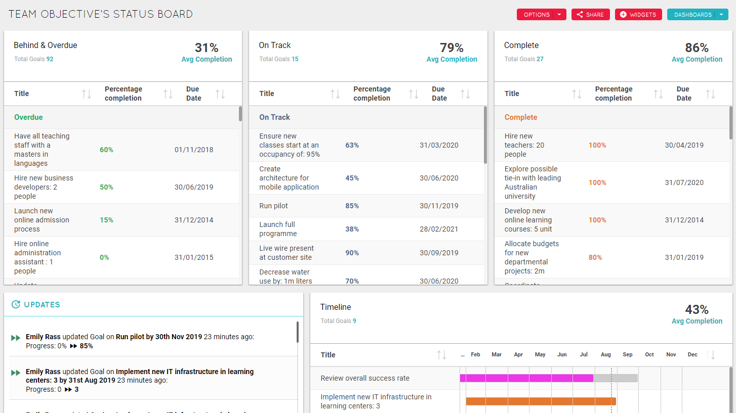
This Dashboard is a great way to display your Goals based on their status to quickly see what is Behind, On Track and Complete. This example is based on Goals from users in My Team and the Goal Template 'Objective'. To set up this example:
- Add your Table Widget
- Click on 'My Goals' and clear the filter
- Click 'Template' and select 'Objective'
- 'Add Condition' select 'Status' > 'is' > 'Behind' or 'Overdue'
- Under Settings select Group by 'Status'
- Save by clicking the green tick in the top-right corner
- Use the column iconfound when you hover under the avg completion to remove Timeline, and add the Due Date column
- Drag the columns to be in the best order, and resize them until you are happy with how it looks
- Clone this Widget to quickly create Tables for 'On Track' and 'Complete' by replacing the filter with the next Status. Repeat for all Status'
- Rearrange and resize the Widgets until the Dashboard looks perfect
If you would like to learn more about how the Table Widget works, check out our knowledge base article here.